

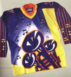
Been a lot of talk recently – thanks in large part to a popular post at the wonderful (and newly revamped) Icethetics – about the direction South Florida’s hockey club may be traveling with regard to the “third jersey” soon to be unveiled. If you haven’t yet read it, do so. It’s packed with fun speculation, and the comments section is where the action is. Only hockey fans could take such pride in debating the merits of a legless feline (don’t fret…I’m there too).
More after Order 66 is executed after the jump…
While that war rages on, I come back to an old friend of ours here at The Box: the crossed stick-and-palm tree centered by sunburst, aka The Secondary Logo. Yes, we’ve covered it in the not-too-distant-past, but being summer and all, it’s high time we revisited what is unquestionably one of the National Hockey League’s more distinctive patches.

Hatched in 1993 as original equipment during the Cats’ inaugural uniform press gathering (difficult to see on the shoulders of the two stiffs quite probably plucked from the waiver wires of the Sunshine Hockey League – now there was a tough union to crack – but I assure you the logos are firmly affixed), the “sunburst” took a natural backseat at the outset to the utterly ridiculous but thankfully short-lived (read: this one presser) paws-and-claws motif on the gloves. Cooler heads obviously prevailed. If then-new league commish Gary Bettman had anything at all to do with the ultimate deletion of those hideous hide-in-the-beer-line embarrassing mitts, he served the NHL with distinction, no matter his future crimes against the sport and its loyal following.
Back to the “‘Burst”. What are the positives with this admittedly simple yet cohesive design? No one over the age of four is necessary to explain the significance: The sun, a palm tree, and a stick, all wrapped into a delightful, non-threatening South Florida motif.
Remember: this was the very same expansion year Michael Eisner’s Disney launched their apocryphal Mighty Ducks of FantasyLand Anaheim, at the same time stealing historical purple from the cross-town rival Kings. ‘Nuff said. As slick as the Ducks logo may have been, the one thing it most certainly was not was Big League. Creative? Yep. Unique? Absolutely. A big seller? Every kid – hockey fan or not – had to have it. Did it “represent” the NHL as a serious organization…up there with the Detroits, Chicagos, and Bostons of the world? They don’t use it anymore (albeit for a variety of legitimate reasons), so that question’s been answered. History be damned. Yes, we’re speaking of Anaheim’s main logo, but it presents a fair view as to the direction of the 1990s NHL, style-wise. One look at this should be convincing enough.
“Cute” was suddenly in. But no one would mistake the Panthers’ primary crest as “non-threatening”. Oh, sorry…try this one. The secondary, however, was met with a mixture of “Okay…I get it…” and forgettable. I for one never thought we’d be staring at it seventeen years later as the only unchanged item on Florida’s uniform. The Cat had a broken stick, blood red morphed into deep blue, and these Panthers did change their stripes: numerous patterns and color variations came and went.
The Sunburst has been a steadying, consistent presence for Florida fans since time eternal, or 1993. Love it or hate it, the ‘burst has been there. The Beezer wore it. The Russian Rocket sported it. King Louie had it. Heck…the darned thing outlasted Denis Potvin and Chris Wells. Talk about Staying Power.

I’ve suggested this before, and will do so again: is it time for a change to the secondary? Been a huge proponent of a stylized “rat” design in the past…can it do any worse than the ‘Burst? Perhaps the sunburst on one shoulder and a Rat on the other. Throw me a bone.
The tree-huggers amongst the crowd will scream from the three-storey Sunrise rooftops, wailing against the exploitation of a poor helpless mammal who died a violent death at the hands of a human barbarian (though he was 32-38-70 pts that year) armed with a lethal weapon (witness the 70 points). To which I say: so what. It’s the stuff of legend. We will all regale our children with the Mellanby tale. That’s a fact. It’s part of the fabric which holds this organization together. And honestly, it’s a far better story than the Octopus deal at the Olympia (pipe down, Wingoids…I worship Gordie too).
So, once more, your thoughts on this most pressing of matters…
Your opinion on the Panthers’ secondary logo:
| Keep the Sunburst…history and all | 105 |
| Annoint the Rat…BETTER history and all | 42 |
| Something entirely different…name it in the comments | 19 |